
Concepts#
This page explains the core ideas behind sysplot and how they are used in practice.
Plot Cyclers#
A full Python example for this topic is available here:
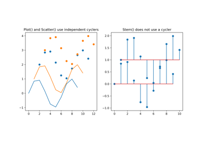
Matplotlib uses a property cycler to assign default styles to new plot
elements. Every call to plot() (or a related function) advances that
cycler. This means multiple distinguishable lines can be plotted without
manually specifying styles. However, different plotting functions use
independent cyclers. For example, scatter() uses an independent cycler
from plot(), while stem() does not use a cycler at all and always
starts with the same default style. This can be shown here:
import numpy as np
import matplotlib.pyplot as plt
x = np.arange(10)
y = np.sin(x)

fig, axes = plt.subplots(1, 2, figsize=(10, 5))
axes[0].plot(x, y)
axes[0].plot(x+1, y+1)
axes[0].scatter(x+2, y + 2)
axes[0].scatter(x+3, y + 3)
axes[0].set_title("Plot() and Scatter() use different cyclers")

axes[1].stem(x, y)
axes[1].stem(x+1, y+1, bottom=1)
axes[1].set_title("Stem() does not use a cycler")
plt.show()
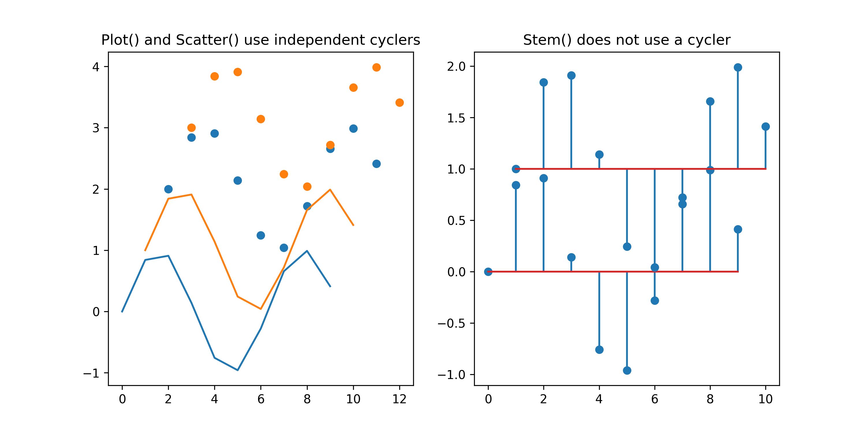
The next example shows what happens when a color is manually specified. Because
the given color is used instead of a cycler value, the cycler is not consumed.
So the next element uses the first element in this case. Since stem() has no cycler, it is omitted here:
fig, ax = plt.subplots(1, 1, figsize=(5, 5))
ax.plot(x, y, color="gray")
ax.plot(x+1, y+1)

ax.scatter(x+2, y + 2, color="gray")
ax.scatter(x+3, y + 3, )
ax.set_title("Specifying colors does not advance the cycler")

plt.show()
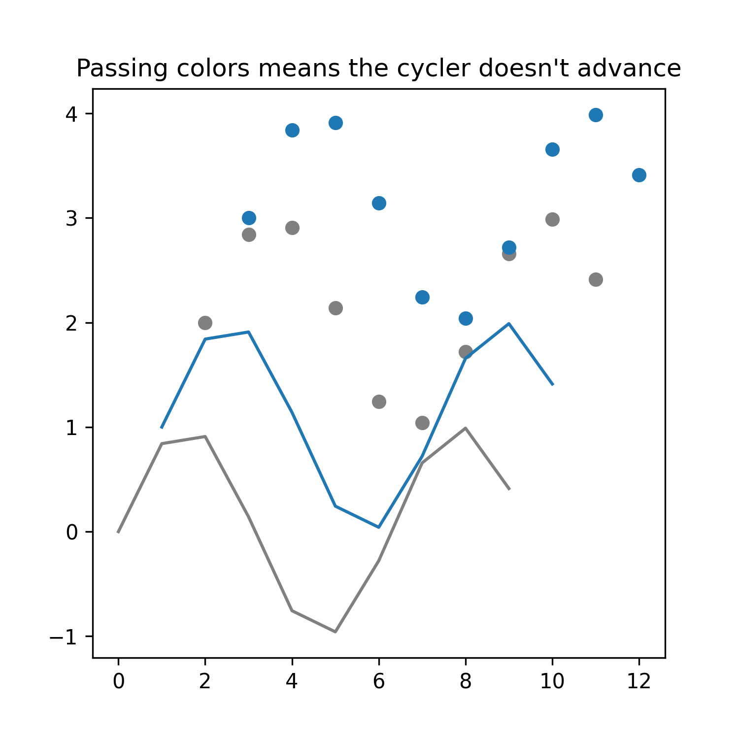
Sysplot extends the cyclers to include both color and linestyle. The goal is
to keep lines distinguishable in black-and-white print contexts without
manually styling every plot(). This can produce surprising behavior because
plot() and scatter() now behave differently.
Specifying both color=... and linestyle=... means a cycler is no longer used
import sysplot as ssp

ssp.apply_config()

fig, axes = plt.subplots(1, 2, figsize=(10, 5))
axes[0].plot(x, y, color="gray")
axes[0].plot(x+1, y+1)
axes[0].scatter(x+2, y + 2, color="gray")
axes[0].scatter(x+3, y + 3)
axes[0].set_title("Specifying colors does advance the cycler only for Plot()")

axes[1].plot(x, y, color="gray", linestyle=":")
axes[1].plot(x+1, y+1)
axes[1].scatter(x+2, y + 2, color="gray", linestyle=":")
axes[1].scatter(x+3, y + 3)
axes[1].set_title("Specifying colors and linestyle no longer advance the cycler")
plt.show()
The sysplot solution#
Instead of manually assigning color and linestyle values, users should access styles directly from the sysplot cycler. Also, many higher-level plotters internally call multiple Matplotlib commands. For example:
sysplot.plot_nyquist()may callplot()multiple times.sysplot.plot_poles_zeros()may callscatter()multiple times.sysplot.plot_stem()may callstem()multiple times.
From the user’s perspective, these should represent a single logical plot
and therefore show only one style. Additionally, all plots from sysplot should
be aligned with the plot() cycler. Some users might also want scatter(),
stem(), and plot() to share style progression.
To support this, sysplot provides sysplot.get_style(), which returns
a dictionary derived from the configured cycler. The return value may look like this:
{
    "color": "#1f77b4",
    "linestyle": "-"
}
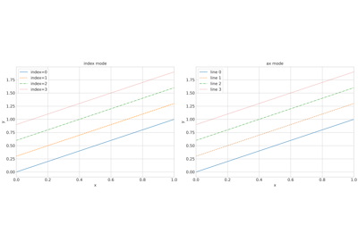
1. Retrieve a style by index#
A specific style can be retrieved directly from the cycler:
style = get_style(index=2)
ax.plot(x, y, **style)
This returns the style at the specified position. This is useful if you want explicit style control or if multiple elements should intentionally share a style.
2. Retrieve the next style for an axis#
Alternatively, the next style can be determined for a specific axis:
style = get_style(ax=ax)
ax.scatter(x, y, **style)
In this mode, sysplot determines the next style that would be used by
plot() on that axis, consumes it, and returns it as a dictionary.
This helps keep functions such as scatter() visually consistent with the
line-style progression used by plot().
For the earlier example, all the inconsistencies can be resolved by calling
sysplot.get_style():
ssp.apply_config()

fig, ax = plt.subplots(1, 1, figsize=(5, 5))
ax.plot(x, y, **ssp.get_style(index=7))
ax.plot(x + 1, y + 1)

ax.scatter(x + 2, y + 2, **ssp.get_style(ax=ax))
ax.scatter(x + 3, y + 3, **ssp.get_style(ax=ax))
ax.set_title("get_style() fixes any inconsistencies")
plt.show()
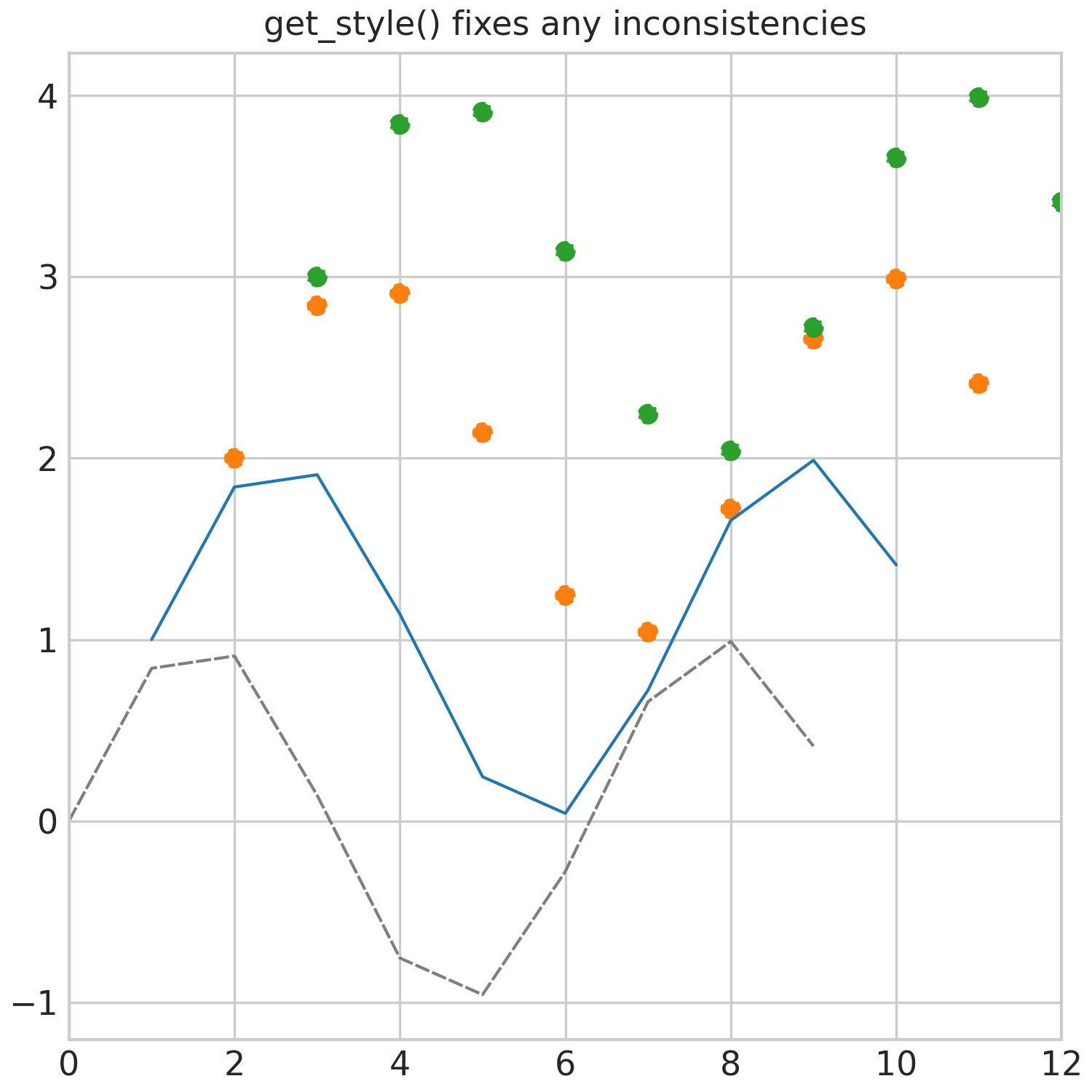
Now scatter() follows the same style progression as plot(), the linestyle is included in
the style, and we can access a preconfigured style by index.
A more comprehensive example of using sysplot.get_style() to ensure consistent styling across multiple plot elements and functions is shown here:
Recommended System Modelling#
A recommended workflow for modeling systems using NumPy and the Control library is shown below. This structure makes it convenient to pass data into sysplot plotters. Other approaches are also valid as long as the resulting arrays match the expected function arguments.
The example below defines a second-order system with a root and computes its frequency response:
import numpy as np
import control as ctrl

# Second-order system with root:
# H(s) = ωₙ² (s + z) / (s² + 2ζωₙ s + ωₙ²)

omega_n = 2.5  # natural frequency [rad/s]
zeta = 0.6  # damping ratio (<1 → underdamped)
z = 1.0  # zero location at s = -1

system = ctrl.TransferFunction(
    [omega_n**2, omega_n**2 * z],
    [1, 2 * zeta * omega_n, omega_n**2],
)

# Frequency grid
omega = np.logspace(-3, 3, 4000)

# Frequency response
mag, phase, _ = ctrl.frequency_response(system, omega)

# Convert to complex frequency response
H = mag * np.exp(1j * phase)

# System poles and zeros
poles = ctrl.poles(system)
zeros = ctrl.zeros(system)
Plotting Functions#
Assuming the variables from the previous section are defined, sysplot provides convenience functions for common control-engineering visualizations.
sysplot.plot_bode()— Plot Bode magnitude and phase diagrams from frequency response data.sysplot.plot_nyquist()— Plot a Nyquist diagram with directional arrows and optional mirror curve.sysplot.plot_poles_zeros()— Plot poles and zeros on the complex plane.sysplot.plot_stem()— Plot a styled stem plot with optional outward-pointing markers.sysplot.plot_angle()— Draw and label the angle between two vectors.
Annotating the Figure#
To improve clarity and readability of figures, sysplot provides several helpers for adding reference elements and adjusting axes behavior. Using these tools is recommended whenever appropriate.
sysplot.emphasize_coord_lines()— Draw coordinate origin lines on all 2D axes of a figure.sysplot.add_origin()— Ensure the origin is included in autoscaling.sysplot.plot_unit_circle()— Plot a unit circle on the current axes.sysplot.plot_filter_tolerance()— Draw generic filter power constraints.sysplot.set_minor_log_ticks()— Add minor ticks at decade intervals on logarithmic axes.
Often, you want to show the relationship between your data and system
parameters. sysplot.set_major_ticks() is especially useful because it
lets you set tick positions with custom labels. You can adjust numerator and
denominator values to display fractions, or limit labels so a parameter is
shown only once on an axis. If you want to highlight a parameter without
changing major ticks, use sysplot.add_tick_line() to add a labeled
reference line.
Since many plots show a time-continuous signal on the x-axis, x-margin is set
to 0 when calling sysplot.apply_config(). To restore default
Matplotlib behavior for a specific axis, use
sysplot.set_xmargin() with use_margin=True.
To repeat tick labels on all axes of a figure with shared axes, use
sysplot.restore_tick_labels().
All of these functions are demonstrated here:
Configuration#
sysplot follows an opinionated design that builds on seaborn styles and
Matplotlib defaults, while applying additional project-specific changes.
To activate these defaults, call sysplot.apply_config(). You can
customize behavior through sysplot.SysplotConfig.
For details, refer to the API documentation and the example below.
Why this package exists#
Sysplot originated from work at Hochschule Karlsruhe, where the diagrams used in the lecture System and Signal Theory by Prof. Dr.-Ing. Manfred Strohrmann were revised.
A central requirement was that all figures should share a consistent visual style and meet a high publication standard. To achieve this, a global configuration system was introduced to control styling, figure dimensions, and export behavior.
Because many diagrams appear repeatedly in the lecture material, common plotting tasks were automated. Additional utilities were created to improve the visual clarity of figures.